


Space Studies Institute (SSI)
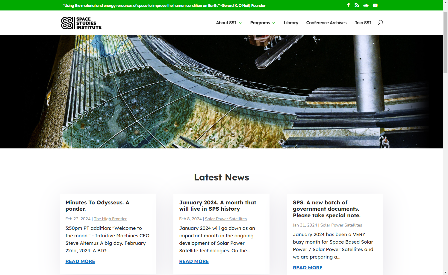
The Space Studies Institute needed a major overhaul to make their complex, technical content easier to navigate — especially for new visitors and potential donors unfamiliar with their mission. The existing site was dense and difficult to manage, so our goal was to bring clarity, structure, and a sense of storytelling to their digital presence.
I led the redesign with a focus on user experience and long-term sustainability. Beyond simplifying the interface and information architecture, I made sure their small internal team could confidently update content without needing outside support. The result was a more engaging, intuitive site that supported both their outreach and fundraising goals.
Audience
-
Primary: Donors, researchers, nonprofit supporters (avg. age 40+)
-
Secondary: Space-curious new visitors
My Role
UX/UI Designer (solo) – full-cycle ownership of research, design, testing, and implementation
Timeline
1 year (2022 – 2023)
Tools Used
Figma, WordPress (Divi), basic SQL database, HTML/CSS
The Problem
The SSI site was dense and intimidating, with:
-
Highly technical content that confused casual visitors
-
Poor navigation—especially for users unfamiliar with space science
-
Unclear donation CTA placement & impact messaging
-
Inconsistent formatting and accessibility issues for an older audience
Project Goals
-
Create a clear, intuitive information hierarchy for diverse audiences
-
Improve readability with accessible typography and responsive design
-
Reinforce donor confidence through persuasive visuals and clear impact paths
-
Enable stakeholder independence via an easy-to-maintain CMS
Design Process
1. Research & Discovery
-
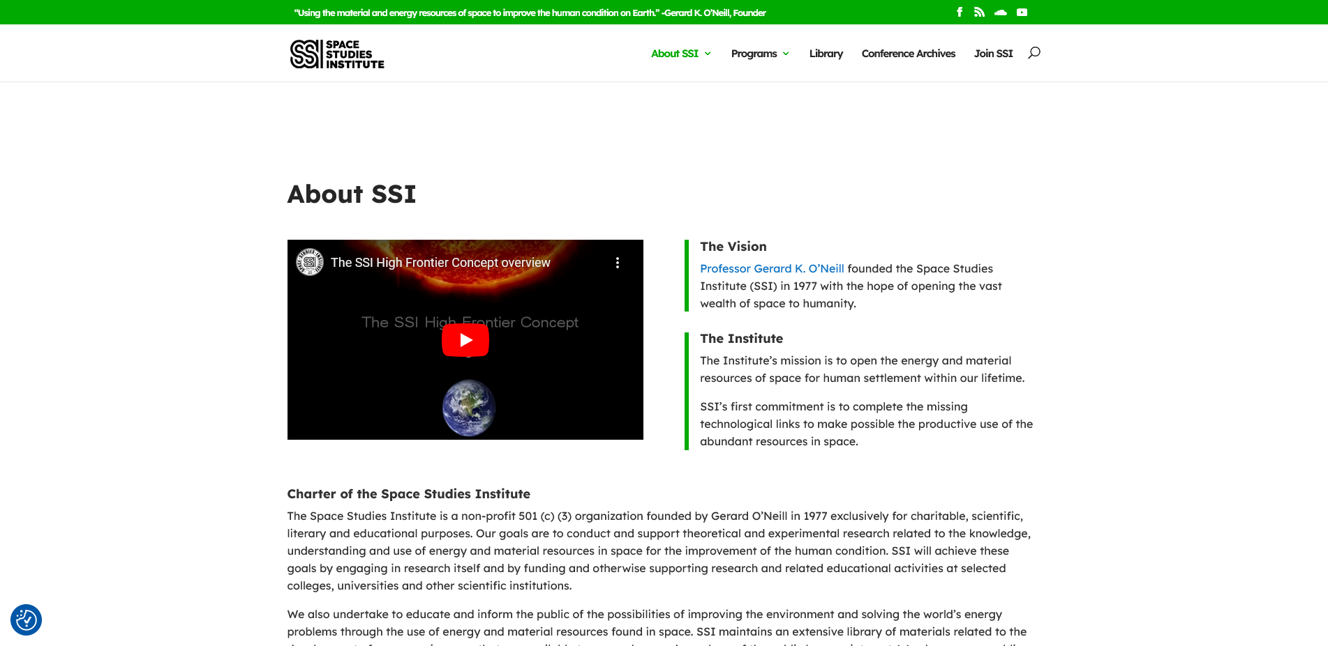
Conducted stakeholder interviews focused on mission clarity, and content priorities
-
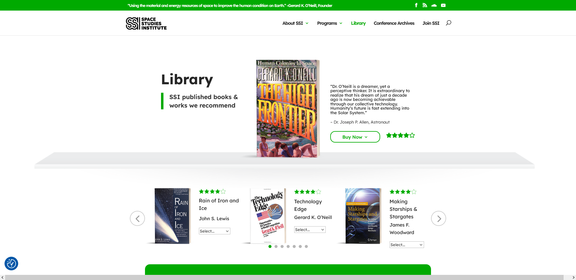
Extracted and analyzed metadata (ISBN, author, value) from the physical library via SQL import to inform value-driven content strategy
2. Information Architecture
-
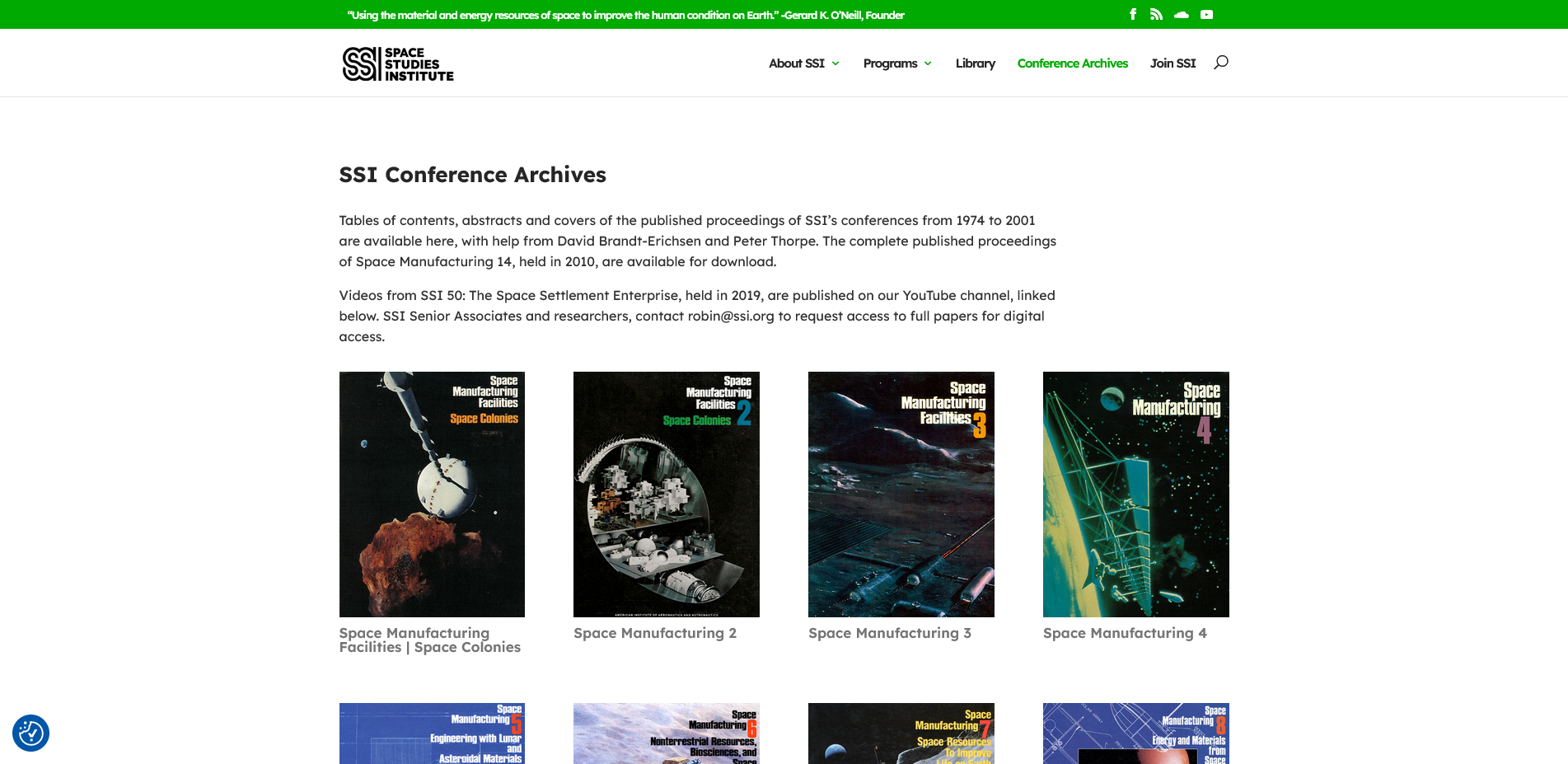
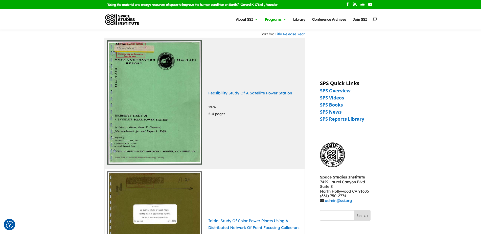
Restructured navigation into logical categories (Research Library, Donate, About SSI)
-
Mapped user flows for both new visitors and researchers
3. Wireframing & Prototyping
-
Designed desktop and mobile wireframes focusing on readability and clear CTAs
-
Iteratively refined layouts in Figma, aligning font sizes and weights with the target audience
4. Usability Testing
-
Tested prototypes with target users (40+ demo) for navigation ease, content clarity, and donation flow
-
Incorporated feedback by adjusting copy, button prominence, and homepage layout
5. Visual Design & Implementation
-
Selected Divi WordPress theme for ease of editing and support
-
Built templates, styled components, and built all pages via Divi + HTML/CSS
-
Collaborated with a developer for CMS integration, ensuring stakeholders can update content
🚀 Outcome & Impact
Core improvements:
- 30% decrease in bounce rate
- 25% increase in donation clicks on homepage
- Stakeholder-reported improvement in site maintenance time