
All Alerts
The Foundation, Not the Destination
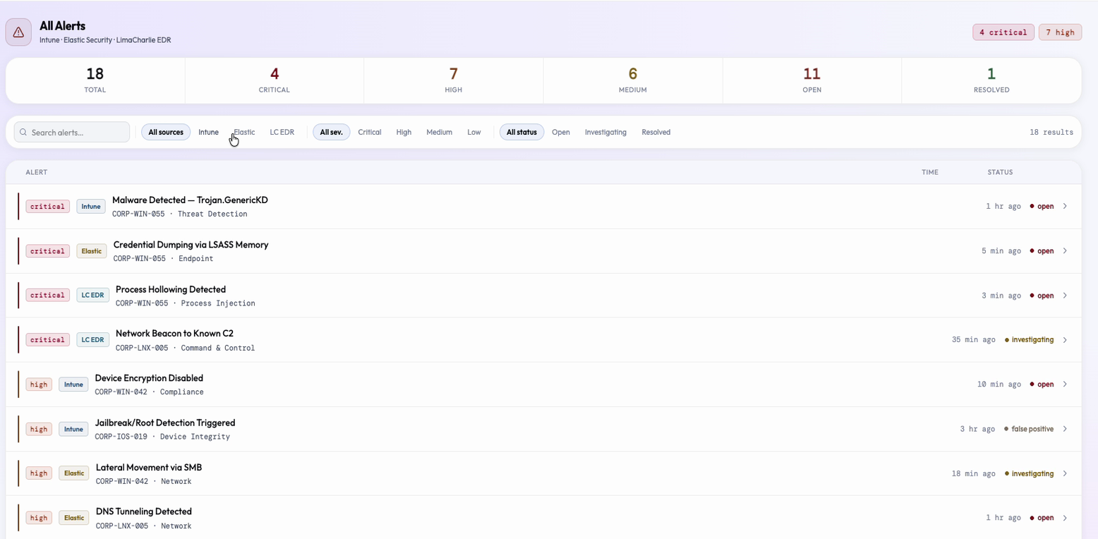
Every mature SOC runs three to five security tools simultaneously. The problem is not that each tool fails at its job. It is that they each succeed in complete isolation. All Alerts is the normalization layer that makes cross-tool triage possible.
Three tools, one severity scale. The translation is the entire value proposition of the screen. And it intentionally ends with an Investigate button, not a "case closed" workflow.
Product Architecture
Signals → Entities → Relationships → Perspectives
This is the product philosophy that organizes every screen in BlendScope. All Alerts is not just a list page: it is the Signals layer, and every other screen in the product depends on what it gets right.
- All Alerts = Signals. Raw, normalized, cross-tool alerts. The list the analyst starts from before any investigation has a direction.
- Live Map = Entities. The devices, services, and users that are the subjects of those alerts, shown in their topological relationship to each other.
- Gravity Well = Relationships. Which alerts belong together, which campaigns share entities, which incidents are connected through shared infrastructure.
- Timeline + Forensic Canvas = Perspectives. Two lenses on the same events: chronological sequence for triage, causal process tree for attribution.
All Alerts cannot be the foundation it needs to be unless the normalization layer it provides is trustworthy. You cannot cluster alerts into campaigns in the Gravity Well until you have normalized them. You cannot surface cross-sensor confidence scores until you have a single list that includes all sensors. The screen is conservative by design because everything else in the product backlog depends on it getting the foundation right.
The Problem
Three tools. Three severity vocabularies. One analyst carrying the translation.
Wazuh uses a numeric scale from 0 to 15, where "level 12" is a meaningful signal to a Wazuh expert and noise to everyone else. Elastic uses critical / high / medium / low but applies its own risk scoring on top of that. LimaCharlie uses a combination of numeric severity and event-type labels.
- An analyst looking across all three tools has to carry a mental translation table to compare whether a "Wazuh 12" is more or less urgent than an "Elastic high." That is not a data-engineering problem: it is a UX problem. The translation should happen in the product, not in the analyst's working memory.
- Alert fatigue compounds this. 500 alerts in a shift are not 500 distinct threats. They are closer to three to five attack patterns repeated across many hosts and rules. The list trains analysts to skim because it provides no help identifying which rows are related.
- When every row looks equally urgent because the severity vocabulary is inconsistent across tools, nothing reads as urgent. The analyst habituates to the overload. The SIEM list trains its users to ignore it.
Core UX Hypothesis
The UnifiedAlert schema is the UX design, not the data model. Deciding which seven fields belong in the list row, and which belong in the detail panel, is where the user experience starts.
The UnifiedAlert Schema: Seven Fields, One Decision
Before writing a single line of component code, it was necessary to decide what fields an analyst actually needs to see in a cross-tool alert list. Not what each tool exposes, not what each tool calls its severity field, not what raw data is available: what an analyst needs during triage.
The answer: severity (normalized), source tool, alert title, affected host, affected user (where available), category, timestamp, and status. Everything else is enrichment that belongs in the expanded detail panel, not the list row. This is an opinionated choice. A tool-centric design would surface each tool's raw fields and let the analyst sort out the vocabulary. The BlendScope approach says: the analyst should not need to know what each tool calls its fields. The schema's job is to present a normalized view.
The practical consequence is immediate: an analyst reading the list sees "high severity, Endpoint, CORP-WIN-042, 10 min ago." They do not see "Wazuh rule 31103." The technical detail is one click away in the expanded detail panel. It is not the thing the analyst has to parse before understanding the alert's priority. That inversion (put the human-readable signal in the row, put the technical detail in the panel) is the schema's core design decision.
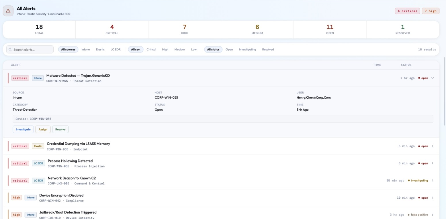
The detail field is the concession to source-specificity: each source contributes one line of enrichment that captures whatever makes its alerts distinctive, without pulling source-specific vocabulary into the normalized columns.
Implementation Notes
The UnifiedAlert schema exposes eight normalized fields (severity, source, title, host, user, category, timestamp, status) plus one free-text detail field. Each source adapter maps its own vocabulary into this shape at ingest: Elastic writes MITRE tactic and risk score into detail, LimaCharlie writes IOC value or event type, Intune writes device identifier. Downstream components (list row, filter logic, detail panel) never read source-specific field names, only the normalized schema.
Source Badges: Tool Identity as First-Class Triage Signal
The source badge answers the analyst's first question when they encounter an unfamiliar alert: "which tool caught this?" That question matters for immediate triage: different tools have different false positive rates, different detection scopes, and different signal quality. An Elastic behavioral detection is a different kind of signal than an Intune compliance flag.
Without the badge in the row, source information would be buried inside the expanded detail panel, invisible during triage unless the analyst opens every row. Making the badge visible in the row means the analyst can see at a glance that three alerts from different source tools are pointing at the same host in the same 10-minute window. That pattern, multiple sensors corroborating the same activity, is one of the highest-confidence signals in threat detection. It should be perceptible without opening a detail panel.
Badge colors are tied to a fixed accent per tool rather than a generic palette, and that mapping holds everywhere the product shows a source identity. Once an analyst learns that a color means "Elastic," that association keeps paying off on every other screen instead of resetting each time they switch views. Over time, analysts read color as tool identity automatically, which cuts down on parsing effort across the whole product.
Implementation Notes
Badge colors are pulled from the design system's tool-accent tokens: Intune = blue, Elastic = amber, LimaCharlie = teal. The same tokens drive source identity everywhere else in the product: Timeline swimlanes, Correlation Chain chips on the Overview, and AI assistant source chips all reuse the identical color-to-tool mapping rather than defining their own.
AND-Combined Filter Chips: Narrowing, Not Expanding
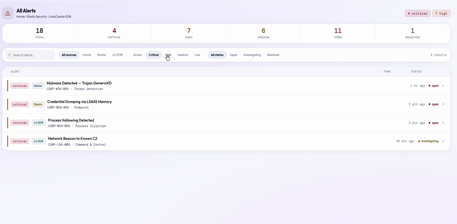
The filter chips combine with AND semantics, not OR. This follows directly from the analyst's mental model during triage. "Show me open criticals from LimaCharlie" is a conjunction: critical AND open AND LimaCharlie. OR semantics ("show me criticals OR LimaCharlie alerts") would produce a larger, less focused result set, which is the opposite of what a filter is supposed to do.
The AND approach means filters narrow rather than expand. Each additional chip reduces the result set, which is the correct direction for triage workflows. This is a small semantic decision with a large UX consequence: an analyst applying three filters expects to see fewer results. If the filter system used OR semantics, the analyst would add a filter to narrow their view and watch the list grow. That is a trust-breaking interaction: the UI is doing the opposite of what the analyst intended, and in a high-stakes environment, that dissonance is not a minor annoyance. It erodes confidence in the tool.
The tradeoff is that OR semantics would be more forgiving: broader, better for exploratory queries where the analyst doesn't know exactly what they're looking for. The case for AND is that analysts investigating an incident already have a mental model of what they're investigating. They want to narrow to it, not broaden from it. Triage is a precision task, not an exploration task. AND semantics serve precision.
Implementation Notes
Filter state is tracked per category (severity, status, source) as a set of active values, plus a separate free-text search term. The visible list is the intersection of all active category sets: adding a chip performs a boolean AND reduction over the alert array rather than a union, so each additional chip can only shrink the result set, never grow it.
Unfiltered Stats Strip: Two Questions, Always Both Visible
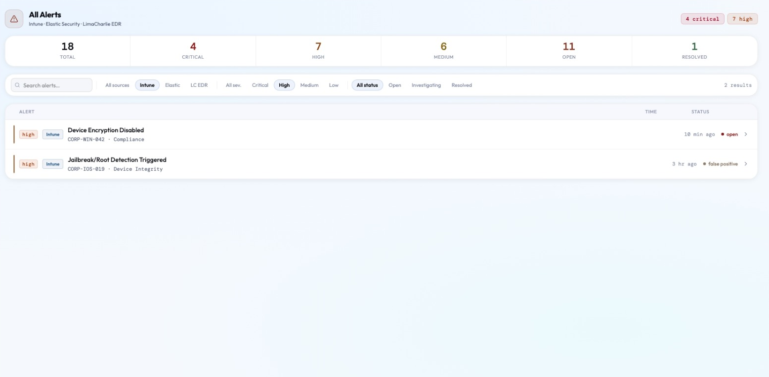
The six stats across the top of the alert list always reflect the full unfiltered dataset, not the current filtered view. This is an information architecture decision that separates two distinct questions that the page needs to answer simultaneously.
The stats strip answers: "how bad is the overall environment right now?" The filtered list answers: "what specific subset am I currently working?" These are separate questions. Conflating them by updating the stats strip when filters are applied would mean that selecting "Elastic only" makes the critical count drop from 4 to 2, which could give the impression that the overall environment improved. It did not. The analyst just narrowed their scope. Filtering their view should not change what the environment looks like.
The practical benefit: an analyst who applies a tightly focused filter ("Critical + Open + fin-ws-047") to work through a specific host's alerts always has the full environmental picture at the top of the page. They know there are 4 total criticals and they are working 2 of them. That reference frame (the unfiltered total as a constant anchor) means the analyst never loses sight of the full picture while drilling into a specific part of it.
This is the same principle as the Gravity Well's default edge hiding: the analyst needs a stable reference frame to reason from. Changing the reference frame whenever the analyst changes their working scope creates cognitive instability. The stats strip stays anchored to what the environment is, not to what the analyst is currently looking at.
Implementation Notes
The stats strip and the alert list read from two different arrays: the strip always aggregates the full, unfiltered alert set, while the list renders the filtered subset. They are two views over one source of truth rather than a single computed value that gets overwritten whenever filters change, which is what would happen if both pulled from the same filtered array.
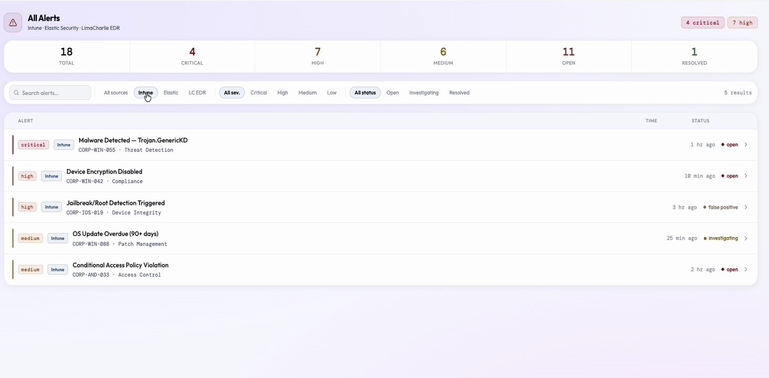
Severity-Coded Rows: Calm Before Critical in a List
The left-edge severity bar provides a strong scannable signal that requires no reading. It is the row's most leftward element, so natural eye movement from top to bottom picks up severity information at the periphery of vision. An analyst scanning the list perceives "there are four red bars in the top section" before they consciously read any row content.
A faint row background tint, reserved only for critical rows, reinforces this for the most urgent alerts without making the list feel alarming at every severity level. An analyst should feel immediate urgency for criticals, moderate attention for highs, and routine awareness for mediums and lows. Tinting everything red defeats the purpose: when every row looks equally alarming, the visual hierarchy collapses and the analyst learns to ignore severity indicators entirely.
This is the "calm before critical" principle applied to a list view. The same principle that drives the warm neutral palette on the Overview drives the light severity tinting here: the default state should feel manageable, so that genuine urgency signals interrupt rather than add to constant background alarm. A list where everything looks critical produces an analyst who treats nothing as critical.
Default sort puts criticals first without any analyst action. This is the correct triage order for the vast majority of sessions. The analyst who opens All Alerts during an active incident sees the most urgent alerts at the top of the list without configuring anything. The signal-first default applies here too: the most important information is the default state, not something the analyst has to reach for.
Implementation Notes
Critical rows get a background tint at 4% opacity; high, medium, and low rows get none, only the left-edge severity bar. Default list order is a single severity-descending sort applied before any analyst interaction, so the array analysts see on load is already ranked without a client-side re-sort.
Honest Gaps
What Is Not Built Yet, and Why That Is the Right Call
Being explicit about incomplete features is more useful than pretending they are finished. Each gap below has a clear design direction and a clear reason it has not been built yet. This is not a limitation document: it is an architecture document.
Pagination / Virtual Scrolling
With 18 mock alerts, rendering all rows is fine. At production scale, windowed rendering via react-window combined with server-side filtering is the right solution. The current filtered.map(a => <AlertRow />) structure is compatible: it can be replaced by a virtualized list consuming the same array without redesigning the schema.
Sort Controls
Default severity-descending sort is correct for most triage workflows. A sort dropdown with severity, timestamp, host, and status options covers the remaining needs. The sort operates on the filtered array, respecting current filter state, with no schema changes required.
Decorative Action Buttons
Investigate, Assign, and Resolve have hover states but no onClick handlers. Wiring them before the authorization tier system is built would mean closing alerts without an audit trail. The architecture for what those buttons do (Read / Low / Medium authorization tiers) is designed and documented. The implementation is sequenced correctly, not forgotten.
Persistent Filter State
Filters reset on page unmount. The fix is serializing filter values into URL search params so filters survive navigation and can be bookmarked. Analysts return to filtered views repeatedly during a shift, and losing filter state on navigation is the same cognitive cost as losing map position persistence on the Live Map.
Time-Range Filter
Timestamps are currently human-readable relative strings rather than Date objects, making range filtering impossible without refactoring the mock data schema. When the data layer moves to real timestamps, preset buttons ("Last 1h / 4h / 24h / 7d") are the appropriate UI addition. The filter chip component already supports adding new chips.
Cross-Sensor Agreement Score
If Elastic, Wazuh, and LimaCharlie all fire alerts for the same host in a 30-minute window, that is one event with three corroborating sensors. A confidence score computed from sensor agreement would float high-corroboration alerts to the top automatically: "3/3 sensors agreed on CORP-WIN-042, credential dump attempt" is a fundamentally different triage experience than 18 individual rows.
Design Philosophy
UX Principles Applied
The page starts by normalizing raw alert data so the list itself is less noisy, not by adding more filters on top of an already overwhelming list. 18 cross-tool alerts instead of three separate tool lists with incompatible severity vocabularies and inconsistent field names.
Criticals appear first without analyst action. Source-specific technical detail lives in the expanded panel, not the list row. The list is the signal; the panel is the depth. The analyst reaches for detail; it is not forced on them.
The host and user fields are first-class in the row layout, not buried in metadata. This primes the analyst to think "something is happening to CORP-WIN-042" rather than "rule 31103 fired." Entities are the investigation unit. Events are the evidence.
The Investigate button exists. The screen does not try to be the investigation destination: it hands off to the Forensic Canvas, Timeline, or Gravity Well. The alert list is the top of the funnel. Investigations should not conclude here.
Severity coloring creates visual hierarchy: critical rows are visually distinct without making medium and low rows feel alarming. The design avoids the failure mode where visual uniformity trains analysts to ignore severity. Calm default means urgent signals actually interrupt.
The action buttons are intentionally decorative until the authorization tier system is ready. Acknowledging this is more credible than pretending they work. The architecture is designed; the implementation is correctly sequenced, not missing.