
Gravity Well
The Campaign Map
Every SIEM demo shows a table. This shows a solar system. The Gravity Well is BlendScope's answer to a problem no production tool has solved: making campaign structure visible before the analyst has to search for it.
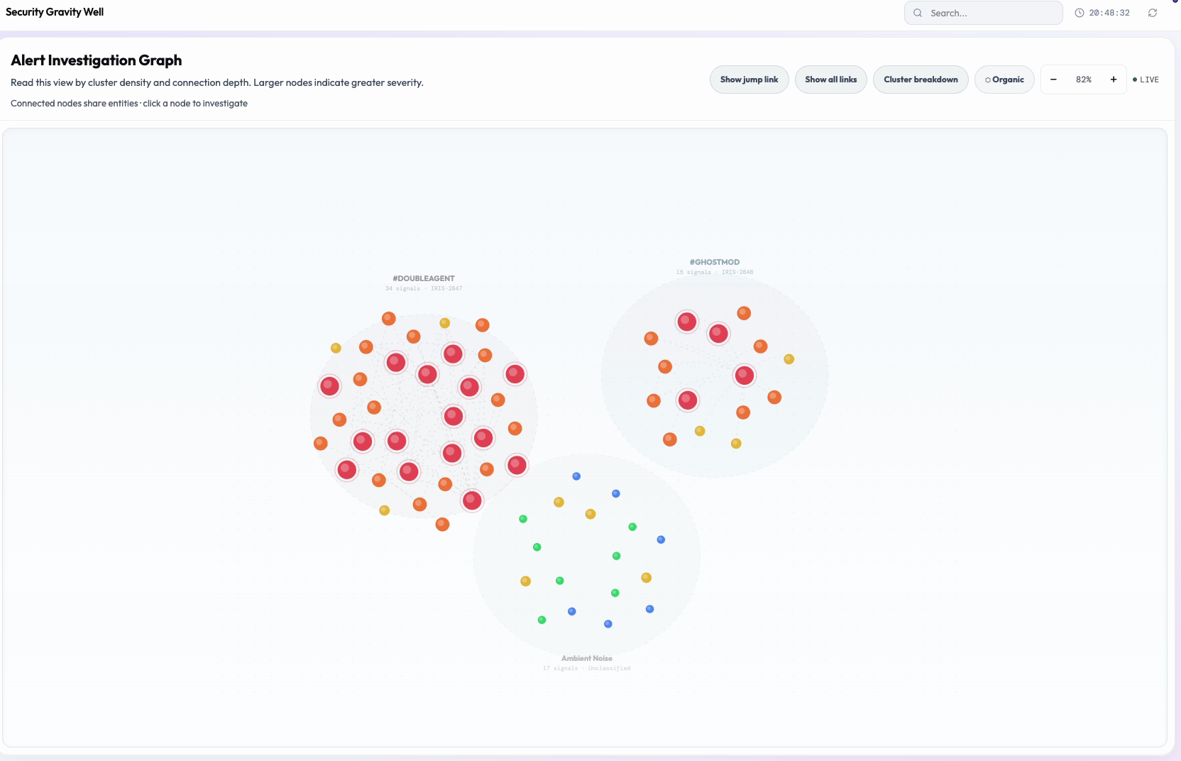
Five hundred alerts become three clusters. Three clusters become an investigation. The layout does the correlation work so the analyst doesn't have to.
The Problem
Correlation is manual. Context is ephemeral.
Every production SIEM puts a table in front of analysts. After a busy night, that table might have 500 rows. The analyst's job is to decide which rows are connected, and the UI provides zero help.
- Alert tables treat ambient authentication chatter and active credential-theft campaigns as the same kind of thing: they are rows in a list, distinguished only by a severity badge.
- Cross-tool correlation requires manually extracting entity values from Elastic, Wazuh, and Sigma, holding them in working memory, and mentally joining them across tools that have never communicated with each other.
- Graph tools either produce unreadable hairballs at realistic alert volume, or collapse so much detail they lose the investigative specificity that makes them useful.
- When an analyst closes the tab, their mental model of "these events are related" disappears entirely. Investigation context lives in the analyst's head, not in the tool, and it resets every shift.
What Existing Tools Do
The analyst becomes the correlation engine.
In CrowdStrike, Splunk, and Elastic, campaign attribution is a manual workflow. The analyst opens row 1, remembers the IP, scans for it in rows 2 through 500, opens a second tool, opens a third, and repeats across a shift.
- Elastic's graph tool shows entity-to-entity connections, not alert-to-alert connections structured into campaigns. It answers "what is connected to what" but not "what attacks are happening."
- Splunk's investigation workbench shows timelines of individual events, not campaign structure. It sequences events but does not group them into coordinated incidents.
- Neither surface the concept: "these N alerts are one coordinated incident and those M alerts are a separate one." That abstraction (campaign as first-class entity) does not exist in any production tool.
- The cognitive cost compounds over a shift. By hour six, the analyst is reconstructing context that should have been stored in the tool hours ago.
Core UX Hypothesis
Analysts think in entities and relationships, not in events and rows. The SIEM's job should be to surface that structure, not ask the analyst to reconstruct it from a flat list.
Force-Directed Clustering: Spatial Position as Primary Encoding
The most fundamental decision was making spatial position carry meaning. In seeded mode, events that belong to the same incident family orbit each other in the same region of the canvas. This is not cosmetic: spatial grouping is the primary data encoding. Everything else on the canvas is secondary to it.
Pre-attentive visual processing handles spatial grouping automatically, at a level below conscious attention. An analyst glances at the canvas and immediately perceives "three clusters, one of which has a lot of critical-severity nodes." That perception takes about four seconds. The same perception from a sorted table takes four minutes, and requires the analyst to construct the structure themselves, which introduces the possibility of error.
Cluster boundaries are drawn soft, not hard: a loose halo rather than a firm outline. That was a deliberate choice informed by how incidents actually work in the field. Clusters in real incidents are fuzzy. Events that share an IP or a user don't automatically belong to the same campaign, and the overlap might be coincidental. A hard boundary would imply a level of confidence the data doesn't support. The soft halo communicates "most of these events are probably related" without asserting a clean partition the analyst might then over-rely on.
Node size also carries meaning: the more severe the alert, the bigger the node. The most dangerous events are, quite literally, the most visually prominent things on the canvas. An analyst's eye lands on the critical nodes first, which is the correct triage order, before they've read a single label. Size becomes a form of attention guidance that never has to ask for attention.
Implementation Notes
Cluster zones render as dashed ellipses with a muted fill color rather than solid strokes, reinforcing the "probable, not certain" read at a glance. Node radius is a direct linear encoding of severity: critical nodes render at 16px, low-severity nodes at 7px, with intermediate severities scaled between. Position within a cluster is produced by a force-directed layout in seeded mode, so members of the same incident family settle near one another without manual placement.
Signal-First Defaults: The Single Change That Made the Canvas Work
In the default view, most connections are hidden. Only the links that represent a meaningful, well-supported overlap between events are drawn, plus anything touching a critical alert regardless of how thin that connection is. The full web of every possible entity overlap is still there, just tucked behind an explicit toggle instead of shown up front.
This sounds like a small setting. It turned out to be the most important design decision on the entire canvas. The first version showed every connection between every pair of events that shared anything at all, all at once. The result was a hairball. Analysts described it as "too much at once, I don't know where to start." The cluster structure was genuinely there underneath, but the sheer density of lines was drowning it out visually. Hiding the weak connections by default was what finally made the clusters visible.
The "Show all links" toggle exists because some analysts do want the full picture, specifically when they're trying to work out whether two incidents that look separate might actually be connected through some faint, shared signal. Keeping that view behind a toggle rather than making it the default means the analyst chooses complexity when they need it, instead of having to wade through it every time. The underlying principle: the first thing an analyst sees should be interpretable, and anything more complex should require an affirmative choice to bring on screen.
Implementation Notes
Cross-cluster edges are hidden entirely by default. Intra-cluster edges only render when two or more shared entities exist between the two events, a threshold chosen to filter out weak, likely-coincidental overlap. Edges touching a critical-severity node always render regardless of entity count, so nothing dangerous gets suppressed by the threshold. The "Show all links" toggle disables the threshold and renders the complete entity-overlap mesh.
Jump Explorer: Cross-Cluster Links One at a Time
When two incidents share an entity (a user account, an IP, a process name), that shared entity is a potential pivot path between campaigns. It might mean the campaigns are related. It might mean a threat actor used the same infrastructure across two separate operations. It might be coincidence. The Jump Explorer's job is to surface these connections without asserting what they mean.
The critical design constraint: if every cross-cluster edge is visible simultaneously, the canvas becomes an uninterpretable web. This was observed directly when the full cross-cluster mesh was prototyped. Analysts could see that incidents were connected but couldn't reason about any specific connection because all connections were competing for attention simultaneously. Analysis paralysis: not from lack of information, but from too much information arriving at once.
The Jump Explorer reveals connections one at a time instead of all at once. The analyst sees a single cross-cluster link, with a short explanation alongside it: which entity is shared, roughly how much time separates the two events, and which two clusters it bridges. This lets the analyst build their understanding of the cross-incident relationship incrementally: one hypothesis at a time, with the supporting evidence sitting right next to the visual instead of somewhere else they'd have to go look it up.
There's also a mode for analysts who want to see how a whole batch of cross-cluster jumps cluster together in time, which can hint at coordinated activity rather than one-off overlap. That's a more advanced view, useful once the analyst already has a mental model of the incident structure and wants to interrogate the timing specifically. It's available, but it isn't the default, because an analyst needs the simple one-at-a-time view before they need the temporal one.
Implementation Notes
In stacked mode the Jump Explorer surfaces exactly one cross-cluster edge at a time. The Jump Story Tray attached to it reports the shared entity, the time delta between the two events, and the two clusters being bridged. A separate jump timeline mode plots all jumps that fall inside a 15% trailing time window, so temporally clustered pivots become visible as a group rather than as isolated links.
Sequence Mode: Story Mode Suppresses Background Context
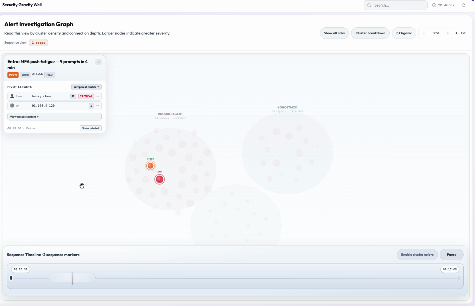
Clicking a node activates sequence mode. Everything not connected to that node fades almost completely into the background, and the remaining events animate into view in the order they actually happened, with a visible path tracing the chain. The name "story mode" is intentional internally: the analyst is asking for a narrative, and the design delivers one.
Hiding the background is a deliberate reversal of the normal state. Ordinarily every node in the cluster stays visible, because that surrounding context is useful for investigation. But once an analyst is following one specific attack chain, everything else in that cluster that isn't part of the chain becomes noise: it competes for attention without adding anything relevant to the question at hand. So sequence mode removes it.
The moving path was added because a static line still asks the analyst to work out the order of events from where things sit in space. Animating it turns that mental reconstruction into something they can just watch happen. Labeling the first and last events plainly removes any doubt about which direction the chain runs, so the analyst never has to stop and puzzle that out.
The transition in and out of sequence mode is animated rather than instant, so the analyst can track what's disappearing and what's staying, and the motion of the path itself gives a felt sense of pacing and direction rather than just an abstract sequence of dots.
Implementation Notes
All nodes outside the connected component of the clicked node dim to 5% opacity. Visible nodes animate in chronological order along orange bezier paths with a traveling dot. START and END labels mark the first and last nodes in the chain. The mode transition animates background nodes down to 5% opacity over 300ms while the path renders in segments, with the traveling dot's speed tuned to stay legible without feeling sluggish.
Pivot on Entity: Single-Click Cross-Canvas Search
The pivot interaction was designed around the core investigation question that arises after a first look at any alert: "Is this user or IP involved in anything else I'm seeing?" Before the pivot was implemented, answering that question required noting the entity value, closing the detail card, filtering the view in whichever tool provides filtering, comparing results mentally, and reorienting. Four cognitive operations, four opportunities to lose the thread.
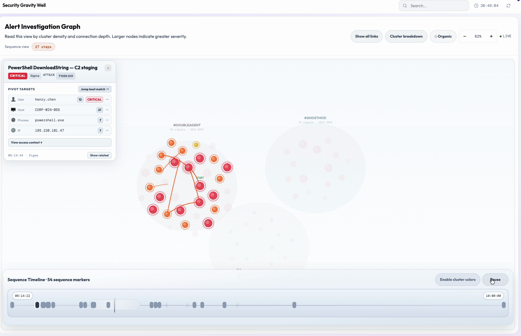
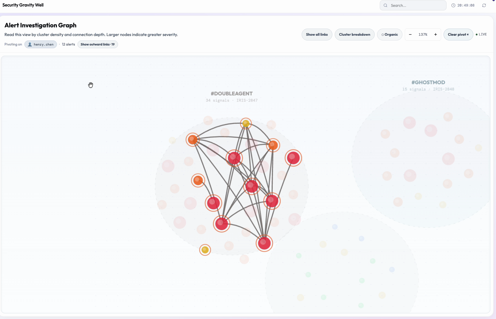
The pivot collapses that whole sequence into one click. Clicking an entity value in the detail card immediately highlights every alert across every cluster that shares it, and the canvas re-frames itself around those matches. A short label confirms exactly what's being shown, for example "Pivoting on henry.chen: 4 alerts." The analyst knows instantly how far this entity reaches and which clusters it touches, without running a query, switching tabs, or losing their place on the canvas.
Entity rows in the detail card are ordered by how risky and how consequential they are, not alphabetically and not by type. So the moment an analyst opens a card, the most dangerous pivot target is already sitting at the top. The single most important follow-up question is the first one they see, rather than something they have to hunt for.
The "Show outward links" control extends the pivot one step further, out to events that are one hop away from the highlighted set, given a distinct, muted visual treatment that reads as "adjacent, not confirmed." That distinction matters most during contested attribution, when the analyst needs to be able to tell the difference between what the pivot directly confirms and what's merely circumstantially nearby, without the canvas overstating the connection.
Implementation Notes
Entity rows are sorted by access-risk weight, then by impact count. Pivoting re-frames the canvas around the matched nodes with an animated zoom and updates the header to a breadcrumb (e.g. "Pivoting on henry.chen: 4 alerts"). "Show outward links" renders bridge nodes, events one hop from the highlighted set, at 55% opacity with a purple ring to visually separate confirmed pivot matches from adjacent-but-unconfirmed ones.
Organic Mode: Louvain as Self-Audit
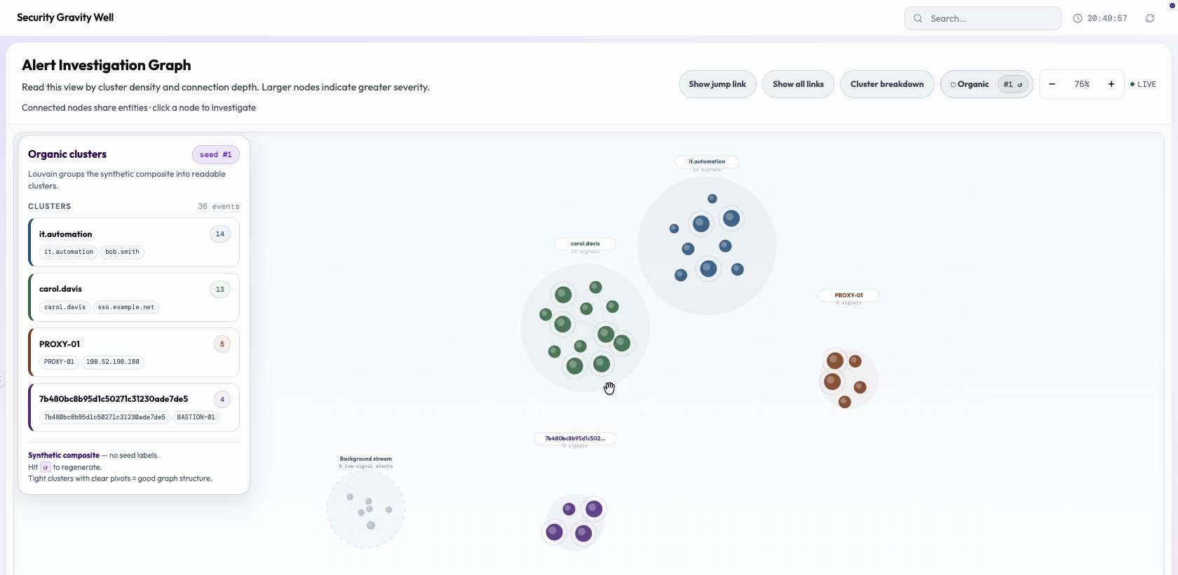
The seeded cluster assignments (DOUBLEAGENT, GHOSTMOD, Ambient Noise) are human-designed categories. They represent an analyst's or a rule author's prior judgment about which alerts belong together. Organic mode exists to answer a question that judgment alone cannot: does the data's actual statistical structure agree with the human-assigned categories?
Organic mode re-derives community structure from the data itself, with no knowledge of the seed categories at all: just which alerts share which entities, and how often. When that independent, data-driven grouping lines up closely with the human-assigned categories, it's a strong sign the categorization holds up. When it doesn't line up, that's a signal worth investigating: either the seed categories are wrong, or there's cross-campaign contamination the analyst hasn't noticed yet.
This makes the Gravity Well a self-auditing system. Rather than asking analysts to simply trust a categorization, it shows them the evidence for it and lets them interrogate it themselves. In a real SOC, campaign attribution is frequently contested, and analysts need to be able to show their work to leadership and incident response teams. A side-by-side comparison panel makes that case visually instead of with a single summary statistic, because seeing the two groupings largely agree, row by row, is simply more persuasive than being told a percentage.
Implementation Notes
Organic mode runs the Louvain community detection algorithm with no seed labels, deriving communities purely from entity co-occurrence weights (which alerts share which entities, how frequently, across what time windows). The Seed vs. Organic comparison panel renders as a stacked bar, with seeded clusters on rows and Louvain proportions as fill, so alignment (e.g. "83% alignment") is legible as matching color proportions rather than a bare number.
Design Philosophy
UX Principles Applied
The detail card is organized around entities (user accounts, hosts, IPs, processes), not around the event record itself. The pivot interaction is entity-first: "show me everything related to this user." Events are the evidence. Entities are the investigation unit.
Default state shows only high-signal edges. Full mesh requires a toggle. Cross-cluster links require the Jump Explorer. Full access profiles require the Access Tray. Every layer of depth is an explicit, affirmative decision: never the default state the analyst has to navigate around.
Every investigation path originates from a canvas interaction. Panels exist to add context to what the analyst has already selected on the canvas. The canvas drives the investigation; the panels do not. Side panels that navigate away from the canvas break the investigation mental model.
Purple always means cross-cluster. Orange always means a sequence path. Dimming always means "not part of what you're looking at right now." Once an analyst learns what a visual cue means in one place, it means the same thing everywhere else on the canvas.
The canvas doesn't classify incidents for the analyst. It reduces uncertainty a step at a time. Each interaction (cluster structure, entity pivot, jump explorer, sequence mode) narrows down the possible explanations without asserting a single answer. The analyst reaches the conclusion; the tool lays out the path of evidence that gets them there.
No actions execute from the canvas: no isolations, no blocks, no case creation. This is both a security architecture decision and a UX decision. An observation surface where accidental clicks can trigger endpoint isolation creates analyst hesitation that undermines the speed the spatial model is designed to enable.