
Timeline & Forensic Canvas
Triage, Then Investigate
Two screens, two phases of the same investigation. The Timeline is for triage: seeing what happened, across all tools, on a shared time axis. The Forensic Canvas is for attribution: seeing why it happened, as a causal process tree.
The Investigate button is the seam between them. It treats the alert list as an entry point, not a destination. That distinction is the product's central design thesis.
Timeline Problem
The analyst becomes the correlation engine.
Every major SIEM presents multi-source event timelines as a flat chronological list. An analyst looking at 40 events across three hours faces the same cognitive load every time: identify source, group by host, compare timestamps. Manually. Repeatedly. Under pressure.
- Wazuh alerts live in Wazuh. LimaCharlie telemetry lives in LimaCharlie. Entra sign-in logs live in Entra. A cross-tool query is a custom saved search or a manual tab-switch, neither of which preserves the investigation state the analyst was building.
- "Show me what happened on CORP-WIN-003 across all my tools in the 20 minutes after this alert" requires a pre-written correlation rule, a custom saved search, or manual context-switching across three consoles. None of those paths are fast enough during active triage.
- The analyst carries the state of the investigation in working memory. In a high-stakes moment, that is exactly the wrong place for it to live. Working memory is occupied by the attack chain; it should not also be occupied by "which tab has the Wazuh view."
Forensic Canvas Problem
Vertical trees reflow. Spatial memory is destroyed.
Process tree investigation in existing EDR tools (CrowdStrike, SentinelOne, LimaCharlie) renders trees as vertical node-link diagrams. When you expand a node, the tree reflows and the layout the analyst was navigating disappears.
- Raw command lines appear in monospace in a table cell: unformatted, unstyled, no syntax highlighting. An obfuscated PowerShell command is entirely opaque at a glance. The analyst cannot identify patterns without reading every character.
- MITRE ATT&CK context requires navigating to a separate "Details" panel, which destroys the spatial position in the tree where the analyst was working. Most analysts keep a separate browser tab open with the ATT&CK matrix for exactly this reason.
- When a node expansion causes the tree to reflow, the analyst loses their place. The spatial memory of "that node was in the middle-left" is invalidated by a layout repaint. Rebuilding that spatial model has a real cognitive cost that compounds across a complex investigation.
Core UX Hypothesis
Swimlane layout turns correlation into a layout problem instead of a search problem. Horizontal BFS makes the attack chain readable as a left-to-right narrative: the same direction attack chains are already written.
Swimlane Layout: Correlation as a Spatial Fact
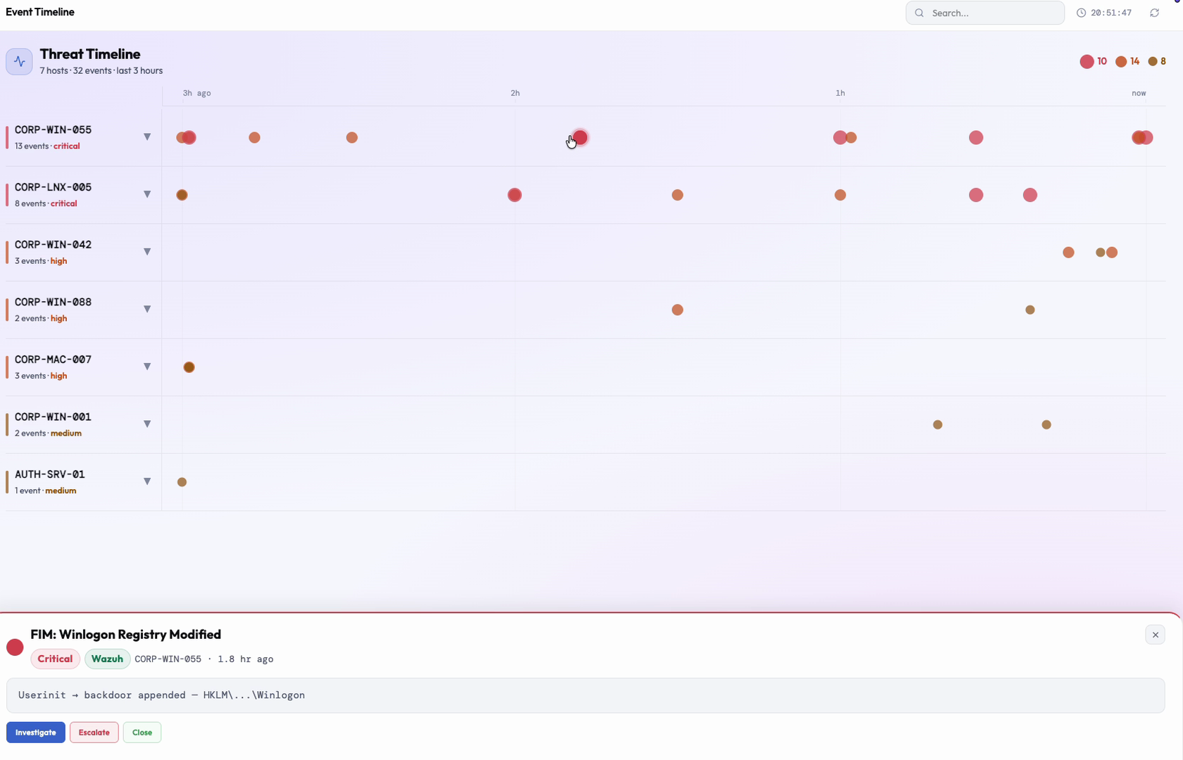
Each source tool gets its own horizontal track, and every event across every tool sits on one shared time axis. The goal was to take cross-tool correlation, which normally requires an analyst to build a mental model by reading timestamps and source labels one row at a time, and turn it into something they can just see.
When Wazuh events always appear in the Wazuh row and Entra events always appear in the Entra row, an analyst no longer has to read the source column to understand provenance: they see it spatially. A Wazuh alert and an Entra sign-in event at the same horizontal position on the same host card are visually adjacent. Their temporal co-occurrence is a layout fact, not an inference the analyst has to construct by comparing timestamps across rows.
An analyst reading downward through the swimlanes is reading cross-tool correlation. An analyst reading left-to-right is reading chronological sequence. Both axes are always present simultaneously, without any interaction, without any query. The layout structure encodes the information that would otherwise require a custom correlation rule to surface.
Spatial proximity is a more reliable signal than visual similarity. Two events with the same severity badge look related, but that resemblance is cosmetic. Two events at the same x-position on the same host card are structurally related. The layout enforces the relationship; it does not merely suggest it. That is the difference between information and inference.
Implementation Notes
Event positions are computed with a toPct() helper that converts each event's relative timestamp into a left-offset percentage within a fixed 185-minute window, so every swimlane shares one coordinate system without per-tool scaling logic.
SeismicStrip: A Navigation Instrument That Looks Like a Chart
The strip above the split panels is not decorative and it is not purely informational. It is a navigation instrument. Spike height encodes severity and spike position encodes time, so the whole investigation window becomes a shape the analyst can scan in one glance, before opening a single record.
Hovering a spike cross-highlights all spikes from the same host and fades everything else into the background. This means the analyst can navigate from "I see a cluster of critical spikes around the 45-minute mark" to "open the Chronicle for the host those spikes belong to" in two clicks, with no search, no filter, no typing. The strip is a map of the investigation window that is also a direct navigation control.
Fading unrelated spikes on hover implements the same "story mode suppresses background context" principle used in the Gravity Well's sequence mode: when the analyst focuses on a host, the entire strip reorganizes around that focus. The noise recedes to near-invisible. The signal (the spikes belonging to the selected host) stays fully visible. The analyst's current question narrows the information field around itself automatically.
This interaction model (navigate by clicking the thing you're interested in rather than by building a filter) is the design principle that connects the SeismicStrip to the Gravity Well's entity pivot to the Live Map's hover-highlight. The pattern is consistent because the cognitive task is the same: let me look at this thing, and collapse everything else.
Implementation Notes
Spike height is scaled by severity: critical events render as 52px spikes, informational events as 10px spikes. On hover, all spikes belonging to the selected host stay at full opacity while every other spike dims to 10% opacity.
CaseChronicle Proportional Gap Spacers: Time as Geometry
The CaseChronicle renders events as nodes on a vertical spine (a per-host view of everything that happened to that machine during the investigation window). The critical design decision is not what events are shown, but how the space between them communicates temporal structure.
Between each event node, the gap itself is rendered as a spacer sized to the time elapsed. A short gap between events renders as a small space; a long gap renders as a visibly tall one. A text label like "14 min later" states the magnitude explicitly, but the proportional spacing makes the same fact pre-attentive: the analyst feels it before reading it.
The analyst perceives "these two events happened close together" and "these two events have breathing room between them" from the layout geometry, before reading any text. This is the critical difference from a flat event list with a timestamp column: a flat list renders temporal structure as data to be read. The Chronicle renders it as the geometry of the layout itself. Time is a distance to be perceived, not a number to be compared.
Why this matters for investigation: an attacker who executes a persistence mechanism, waits over an hour, and then begins lateral movement is relying on analysts not noticing the temporal gap. A flat list with two consecutive timestamped rows requires the analyst to compute the gap themselves. A tall spacer between those two nodes makes the gap visually significant: something that demands an explanation, even before the analyst reads the timestamps.
Implementation Notes
Spacer height is computed with gapH = 18 + (gapAfter / maxGap) * 70, so a 2-minute gap renders close to the 18px floor and a 90-minute gap renders close to the 88px ceiling, scaled relative to the largest gap in the current view.
The Investigate Button: Architecture, Not Just a Feature
In most SIEM tools, an alert row has two terminal actions: Acknowledge or Create Case. Both are administrative: they record that investigation happened or should happen. Neither begins investigation. The analyst still has to navigate elsewhere to look at the process tree, the command history, or the attack chain. The action buttons close the alert workflow; they do not open the investigation.
The Investigate button inverts this entirely. Clicking it takes the analyst straight into a full-screen Forensic Canvas with the relevant process tree already loaded, the alerting node already selected, and the attack path already traced out. The analyst arrives in the investigation itself, not at a blank canvas they still have to configure.
The design thesis that produces this: "The canvas is the center of gravity; tables and lists lead into a canvas investigation, they do not terminate there." The Timeline identifies which entity, which host, which event cluster needs investigation. The Canvas is where investigation happens. The Investigate button is the seam connecting them: the thesis made into a single affordance.
This is also why the button is deliberately styled as the heaviest, most solid action in its group rather than left to inherit whatever style happened to be nearby. Visual weight should map to the weight of the action it triggers, and that mapping should never be implicit, because implicit consequence communication fails under stress.
Implementation Notes
Clicking the button in the AuraTimeline detail drawer launches ForensicCanvasPage as a full-screen overlay, with the selected event's process tree pre-loaded, the alert node pre-selected, and the attack path breadcrumb already computed. The button carries an explicit variant="solid" prop rather than inferring style from context, matching the InlineBtn variant system (ghost, solid, destructive) used across the product.
Horizontal BFS Layout: No Reflow, No Lost Spatial Memory
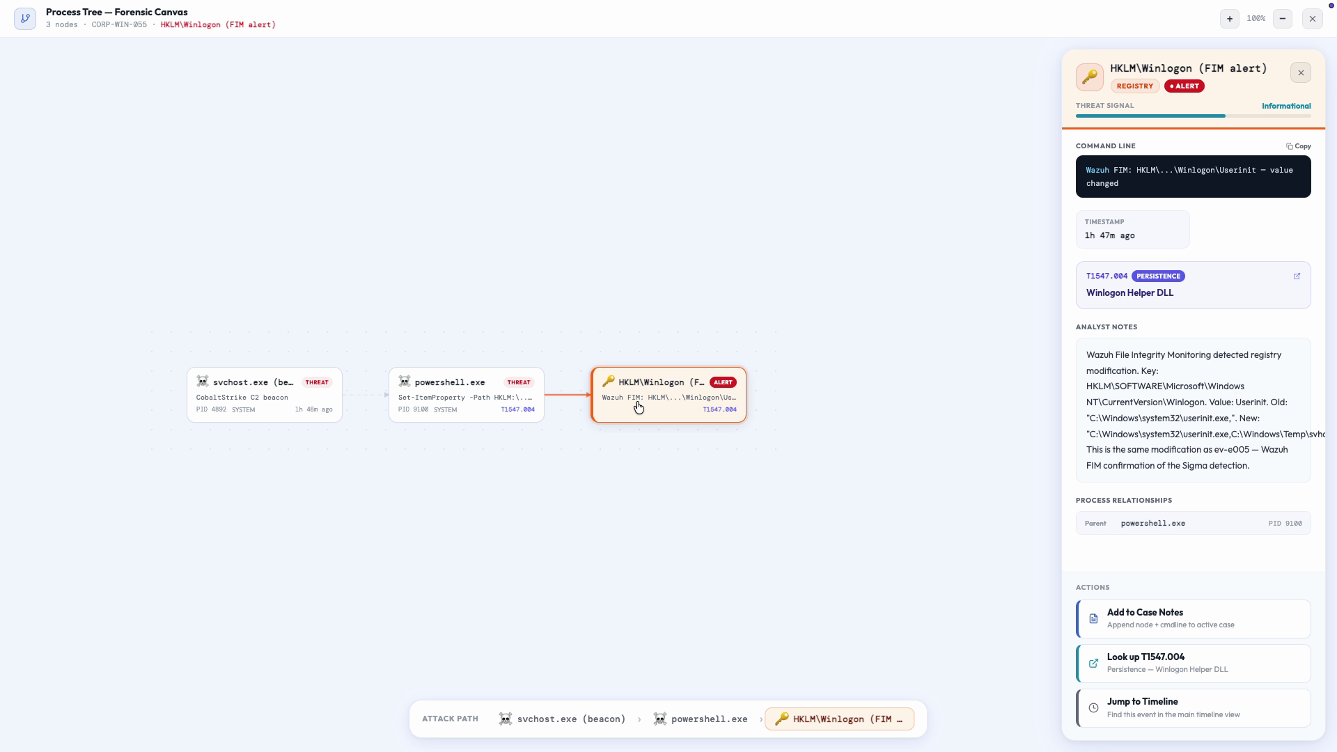
The process tree grows rightward without ever reflowing. When the analyst clicks a node to open its detail panel, the tree does not repaint. The panel appears. The tree stays. The analyst's spatial memory of where every node sits is preserved across the entire investigation session.
Depth maps left to right onto attack chain progression: root cause is on the left, impact is on the right. This directly matches the direction English-language attack chain descriptions are written: "the attacker gained initial access via phishing, then executed a PowerShell dropper, then achieved lateral movement to the domain controller." Left to right. The layout and the narrative share the same reading axis, so the analyst's mental model of the chain and the canvas representation of it are spatially aligned.
Vertical position encodes concurrency: nodes at the same depth occurred at the same stage in the causal chain, not necessarily at the same wall-clock time. Sibling rows are things that happened "in parallel" within the chain's progression. Parent nodes are always centered over their children, so a parent that caused three children visibly looks like it caused all three equally, not like it spawned one and the others happened to follow.
The reason vertical trees were rejected is not aesthetic. Vertical trees reflow on node expansion, which destroys the spatial memory the analyst builds while navigating. The cost of that destruction is real: the analyst must re-scan the entire tree to find where they were. In a large, deeply-expanded investigation, that overhead compounds. Horizontal layout eliminates it entirely by making the tree stable: it grows, it does not shift.
Implementation Notes
Layout is computed in two passes: a BFS pass assigns depth and x-position, then a post-order DFS pass assigns row and y-position, centering each parent over the vertical span of its children so the tree's visual center of mass stays correct as it grows.
Syntax Highlighting + Threat Signal Bar: Obfuscation Made Visible
Raw command lines in production EDR tools appear as monospace strings in table cells: no syntax differentiation, no visual parsing assistance. An obfuscated PowerShell command is entirely opaque at a glance. The analyst must parse every character to identify the patterns that signal malicious intent.
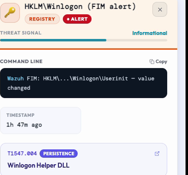
The Forensic Canvas command line block splits each command visually into the executable and its arguments, so the executable stands apart in its own color from everything that follows it. The effect is immediate: the program name separates visually from its argument string. An analyst scanning for known suspicious flags finds them in a consistent visual zone, at the start of the argument block, not buried in the middle of an undifferentiated string.
The highlighting does not decode the obfuscation. It makes the obfuscation visible as a pattern, which is the necessary first step toward decoding it. An analyst who can immediately see "this is a base64-encoded command argument" can make a triage decision about whether to decode it. An analyst staring at an undifferentiated monospace string has to work harder to reach the same starting point.
The threat signal bar in the DetailPanel header gives an immediate gestalt of node suspicion before the analyst reads any text. A color scale running from calm to alarming provides a pre-attentive "is this node alarming?" signal. In a process tree with several nodes, scanning the bars tells the analyst which nodes deserve deep reading before they've clicked anything. The bars sequence the investigation correctly.
Implementation Notes
Command lines use a dark terminal-style background with a two-token syntax model: the executable path (the first whitespace-delimited token) in sky blue, and all arguments in light slate, split with cmd.match(/^([^\s]+)(.*)?$/s). The threat signal bar transitions color at fixed thresholds: red at 80+, amber at 50+, cyan at 30+, gray below 30.
Attack Path Breadcrumb + Escape Key Progressive Dismissal
The breadcrumb strip at the bottom of the canvas shows the causal path from root to the currently-alerting node as a chain of pills. The last pill (the alert node) is visually distinct; every ancestor pill is muted. The visual reads: "these are ancestors; this is what triggered." In a deep tree, this eliminates the navigation task of mentally tracing backwards through edges while simultaneously reading a detail panel.
The breadcrumb sits over the canvas without ever intercepting a click or a drag, so the analyst can pan the canvas with the breadcrumb visible at all times. It is informational infrastructure, not a navigation control that competes with the canvas interaction model.
Pressing Escape first closes the open detail panel. Pressing Escape a second time closes the entire Forensic Canvas overlay and returns the analyst to the Timeline. This is deliberate progressive dismissal: two distinct levels of "I want to back up." If the analyst accidentally opens the wrong node's detail panel, the first Escape recovers them to the canvas with no consequence. The second Escape is the real decision to leave the canvas entirely. The design builds friction proportional to consequence: small mistake, small recovery; big exit, intentional choice.
Scroll isolation in the detail panel means the analyst can scroll through a long obfuscated command line in the panel while the tree remains stationary in the background. Two simultaneous cognitive tasks (reading command output and maintaining spatial context of the process tree) happen with zero interaction conflict.
Implementation Notes
The breadcrumb pill chain (example: [system] › explorer.exe › cmd.exe › powershell.exe › svchost.exe (alert)) is rendered with pointerEvents: none so it never intercepts panning. Scroll isolation in the detail panel calls e.stopPropagation() on onWheel, so scroll events never reach the canvas behind it.

Design Philosophy
UX Principles Applied
The Timeline groups by host, not by event. The Canvas represents processes as nodes, not log lines as rows. The analyst navigates a world of things that exist, not a world of things that happened. Investigation centers on entities (devices, processes, users), not on the records that describe them.
The Timeline identifies which entity needs investigation. The Canvas is where investigation happens. The Investigate button connects them. Neither screen is a dead end: both lead somewhere, and the direction of travel is always toward more structured investigation, not toward an acknowledgment workflow.
SeismicStrip hover fades unrelated spikes into the background. CaseChronicle focuses on one host. Canvas initial zoom centers on the alert node. Each is an implementation of the same principle: when the analyst asks for a narrative, collapse everything that isn't part of it. The question narrows the visual field around itself.
Buttons are styled by how serious the action behind them is, not by convenience. The button that cuts a device off the network looks different from the button that opens a read-only canvas. This mapping is explicit, never inferred from context, because implicit consequence communication fails under stress.
The process tree layout eliminates reflow. Scroll isolation prevents unintended canvas movement. The detail panel appears without displacing the tree. Every design decision that preserves spatial context is a decision to preserve the cognitive investment the analyst made building their mental model of the process tree.
Scroll isolation in the detail panel means the analyst can read a long obfuscated command line while the process tree remains stationary in the background. Two simultaneous cognitive tasks (reading and maintaining spatial context) with zero interaction interference.