
Live Map
Security is a Graph Problem
Existing tools show you infrastructure or identity or endpoints, never all three at once. The Live Map exists because lateral movement is a graph traversal problem, and you cannot see a graph in a log file.
A pan/zoom network topology that makes attack paths visible as geometry, MDM enrollment gaps visible as absent rings, and blast radius visible as propagation (before an incident, not after).
The Problem
Five consoles, five mental models, no shared concept of a device.
A security analyst investigating a lateral movement alert today has to hold five separate mental models simultaneously: Entra for identity, Intune for device compliance, a network monitoring tool for traffic topology, an EDR console for endpoint telemetry, and a SIEM to correlate signals across all of them.
- Entra shows a user authenticated from two countries in 30 minutes but gives no way to see whether that device was enrolled in MDM at the time. That requires Intune, which is a different console with a different session.
- Intune shows a compliance status table but nothing about where that device sits in the network topology. You know the compliance state but not what it can reach.
- Network diagrams show topology but without identity or security posture overlaid. You can see connections but not which devices are managed, enrolled, or running EDR agents.
- EDR consoles show host health but have no spatial model of the fleet. Every pivot between tools is a context switch, and every context switch is an opportunity to lose the thread of the investigation.
The Bet
Where things are tells you how attacks propagate.
A list of alerts does not tell you that the compromised endpoint is two hops from the domain controller. A compliance table does not tell you that the device with a broken EDR agent is the only one on a particular network segment. A map does both, immediately, without a query.
- The moment you render devices as nodes with edges to services, attack paths become visible as geometry. The shortest route from an attacker-controlled node to a high-value target is a path you can trace visually.
- A dashboard is a summary of what happened. A map is a model of the environment in which things happen. Those are fundamentally different tools for fundamentally different cognitive tasks.
- Security decisions made with a map are structurally different: you reason about chokepoints, blast radius, and propagation, not just severity counts and timestamps.
- When attack dwell time is measured in hours, the cognitive overhead of five consoles is a real operational liability. The map eliminates that overhead by collapsing five mental models into one.
Core UX Hypothesis
Lateral movement is a graph traversal problem. You cannot see a graph in a log file. The Live Map makes attack paths visible as spatial geometry, before an incident, not reconstructed after.
MDM Orbit Rings: Three Management Planes, Simultaneously Visible
The earliest prototype used a central "MDM" node with dotted lines radiating out to each device, a classic star topology. This was wrong in two ways, and both problems ran deep enough that they required a complete rethink of the data model being communicated.
First, it implied MDM is a single thing. It is not. A MacBook in a corporate fleet is simultaneously enrolled in Apple Business Manager (corporate device enrollment, managed by the OEM relationship), Intune or Hexnode (device management profiles and policy enforcement), and Entra ID (identity federation and conditional access). These are three separate vendors, three separate control planes, and each has its own independent enrollment state. A device can be fully enrolled in ABM, missing its Intune profile, and have a broken Entra relationship, all simultaneously. A single MDM node with one edge per device communicates none of this.
Second, dotted lines from a single source cannot communicate simultaneity: the visual language of "connected to" cannot show "enrolled in three different things at once with three independent states."
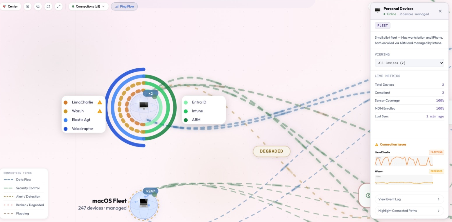
The orbit ring solution inverts the mental model: each device becomes its own center of gravity, with MDM services orbiting it. Three concentric rings sit at distinct distances from the device, so enrollment gaps read as absent rings rather than missing rows in a compliance table. The satellite metaphor is semantically accurate: the device does not connect to MDM. MDM orbits the device, which is precisely the relationship in a managed fleet.
Giving each ring its own direction and rhythm of motion was deliberate. If every ring moved the same way, a glancing look at many devices would produce visual noise with no distinguishing feature between planes. A distinct motion signature per ring means each one is recognizable at a glance, without reading a label. When an analyst has 40 devices on screen and needs to spot MDM gaps, that label-independence is a requirement, not a preference.
Implementation Notes
Three concentric arcs are drawn at radii 35, 50, and 64 around the device node, one per management plane (ABM, Intune/Hexnode, Entra ID). The Hexnode ring animates counter-clockwise while the other two rotate clockwise at different speeds, so the three rings are distinguishable by motion alone rather than by color or label at small scale.
Shimmer / Ping Flow: Configured vs. Actually Flowing
Topology maps cannot normally answer the most operationally relevant question about any edge: "is data actually flowing here, or is this connection just configured?" A static line says these things are connected. That says nothing about whether the connection is actively carrying telemetry.
The shimmer animation answers that question. A moving shimmer on an edge means telemetry is flowing along this path right now. A static line means the connection is configured but silent. A broken dash means the connection itself has failed. Three distinct visual states for three distinct operational problems, each with different remediation paths and different urgency levels.
When an analyst sees a shimmer absent on an edge that should be active, that silence is a signal. A configured-but-silent connection between a device and its EDR agent might mean the agent stopped sending telemetry without going offline, which is exactly the kind of pre-failure state that matters before it becomes a full outage. Or, in an adversarial context, it might mean the agent was silenced. The shimmer makes that distinction visible without a query.
The animation was designed to sit in the background rather than compete for attention: smooth and continuous when things are healthy, and it steps aside gracefully for analysts who prefer reduced motion. The edge stays visible as a line either way, just without the flow indicator. The goal is for the shimmer to feel like ambient infrastructure, something you stop noticing when it's present and only notice when it's gone.
Implementation Notes
Shimmer is a CSS-driven gradient sweep along each edge path rather than a JavaScript timer, which keeps it smooth at 60fps without main-thread blocking and lets it respect prefers-reduced-motion automatically.
NodePanel On-Canvas: Spatial Context Preserved
Clicking a node opens a detail panel on the right side of the map without navigating away. This was a deliberate choice against the conventional "click to open a detail page" pattern. The reasoning is the same reasoning that drives the Gravity Well's consequence-free canvas: the moment you leave the map, you lose the spatial context that makes the map useful.
An analyst investigating a device needs to see it in context: which other nodes connect to it, whether those connections are healthy, how it sits in the network topology relative to high-value targets. If clicking a device navigated to a device details page, that spatial model disappears. The analyst is now looking at a row of properties with no way to see the network position that made this device interesting in the first place.
The NodePanel preserves the map as the persistent frame of reference. The "Open Dashboard" action inside the panel is the intentional handoff point: when the analyst has determined they need the full dedicated device view, they opt in explicitly. The map is never taken away by default; the analyst chooses to leave it.
The hover-highlight behavior reinforces this. Hovering any node fades all unrelated edges to near-invisible and highlights only the edges directly connecting to that node. The analyst can ask "what does this device touch?" and get an instant visual answer, without reading a connection list, without opening the panel, without any interaction beyond a hover. For lateral movement analysis, that is the first question and it should have zero friction.
Edge Health Degradation: Continuous, Not Binary
Edge degradation is not a binary state. A connection that starts failing shows elevated latency before it becomes intermittently reachable, and then fully broken. Representing this as a binary healthy/broken state throws away information that matters for diagnosis: you can't tell the difference between a network problem and an outage if the UI collapses them into the same visual state.
The four edge health states (healthy, degraded, flapping, and broken) each get a distinct color and pattern, and the transition between them happens gradually rather than snapping between states. The analyst sees the degradation unfold over time, which mirrors how real connection problems actually develop and avoids the false urgency of an abrupt binary flip.
The pace of the animation is itself part of the message. A flapping edge, one that's alternating rapidly between up and down, reads visually faster and more agitated than a degraded edge with slow, elevated latency. A slowly pulsing edge reads as "something is wrong but it's holding." A rapidly cycling edge reads as "this is actively unstable." That distinction is visible before the analyst reads a label or opens a panel.
Implementation Notes
Each health state has its own stroke color and stroke-dasharray. Stroke, dash pattern, and animation duration all transition over 0.8 seconds via CSS so state changes render as a smooth interpolation rather than an instant swap. Flapping edges use a faster dash-cycle animation than degraded edges to encode instability type through rhythm, not just color.
Blast Radius Foundation: The Graph Is Already a Model
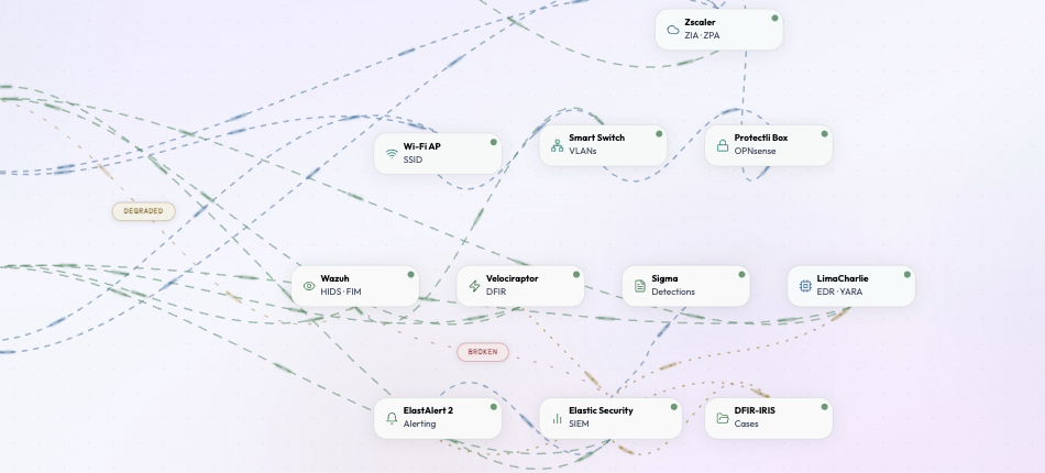
The Live Map in its current state is the topological foundation for the Blast Radius Simulator, the next major capability in the product backlog. This is worth being explicit about: the current map is not a wireframe sketch of future functionality. It is a working graph data structure that already encodes the security relationships the simulator needs to query.
The concept: click any device node and watch potential compromise propagation animate outward along real topology. A compromised endpoint can reach the services it connects to: Zscaler, Entra, the EDR tools with agents on it. From those services, the compromise can propagate to other endpoints enrolled in the same services or connected through the same network paths. The propagation follows the edges that already exist in the map, with edge health determining propagation probability.
Every edge in the current map represents a real security relationship. An EDR edge from Wazuh to a Mac means Wazuh has an agent on that Mac. It also means a compromised Mac could potentially tamper with that agent's reporting. An MDM arc from Entra to a device means Entra can push configuration to it. It also means a compromised Entra tenant could push malicious configuration to that device. The edges are not just topology lines. They are attack surface lines.
Designing the map to already carry this meaning was the point: the simulator does not need a separate model of the environment built later. It just needs to add a propagation animation on top of relationships the map already understands. The map is the data structure. The simulator queries it.
Implementation Notes
The existing EdgeGroup typing and connectedIds hover logic already give every edge a typed relationship and a fast lookup of what connects to what, which is the exact foundation the blast radius simulator needs to calculate propagation without re-modeling the graph.
localStorage Position Persistence: Saving Cognition
When an analyst rearranges the map (grouping the EDR tools together, moving the Mac fleet closer to the network gear it connects through, positioning the domain controller at the center of the layout it actually occupies), that arrangement is knowledge. The analyst has encoded their mental model of the environment into the spatial positions of the nodes. If they navigate away and come back to find everything reset, that knowledge is gone.
This was not a theoretical concern. It was observed directly during development: an analyst would invest time in arranging the map to reflect how they understood the environment, navigate to a device dashboard via the NodePanel, return to the map, and find everything reset to the default force-directed layout. That is context destruction. The cognitive cost is not just the time to rearrange: it is the disruption of the spatial memory the analyst was relying on to hold the topology model.
The draggable MDM control-plane zone is persisted as a single unit: when the analyst moves the group containing ABM, Hexnode, and Entra, all three services move together and that grouping is remembered across sessions. This reflects the "context survives handoffs" principle that runs throughout BlendScope: the tool should remember how you left it, because how you left it encodes your understanding of the environment.
Implementation Notes
Positions are saved to localStorage under separate keys per theme, as per-node JSON objects merged on load so nodes that didn't exist in a previously saved layout don't get clobbered by it. The MDM control-plane zone persists as a single grouped entry rather than three independent node positions.
Design Philosophy
UX Principles Applied
Clicking a node opens a panel on the map, not a new page. "Open Dashboard" is a deliberate opt-in handoff. The map is the investigation's spatial frame of reference: the analyst should only leave it when they've decided to.
Node status dots, edge shimmer, and orbit ring health all communicate continuously without demanding action. The analyst glances and knows. A critical node pulses gently to draw the eye; a healthy node stays visually quiet. The map is a peripheral awareness surface, not an alert board.
Edge health degrades through four states with distinct colors, dash patterns, and animation speeds. The transition is gradual, so the analyst sees the change happen, not just the before and after. Animation speed communicates the type of instability, not just its presence.
The map remembers how the analyst left it. Their spatial arrangement of the topology is knowledge: resetting it on navigation is context destruction. The analyst built the arrangement; the tool should keep it.
Network topology, device management state, and security tool enrollment are visible simultaneously in one canvas. The analyst reasons about the same environment an attacker reasons about: all relationships visible at once, not siloed across five consoles.
Every edge encodes a real security relationship. The MDM arcs are not styling: they are control plane data. The shimmer is not decorative: it encodes telemetry flow. The graph can be queried for blast radius because the edges carry typed semantic meaning.