
Overview
Command Center
Most SIEMs show data. The BlendScope Overview shows system behavior. The difference is whether an analyst has to perform interpretation or whether the screen performs it for them.
Seven agents, nine MITRE stages, three correlation chains, and a 48-device fleet, all readable in two seconds without clicking anything.
The Problem
Statistics dashboards produce analyst fatigue by default.
Every major SIEM ships an overview that is, in practice, a statistics dashboard. Elastic shows bar charts and numeric counts. Splunk shows tables. Wazuh shows pie charts. These surfaces tell you numbers, not stories, and they all share the same fundamental failure mode.
- Telemetry flow is invisible: you see events-per-second as a number, not as something you can feel dropping. The difference between 847 and 312 EPS requires you to remember what the number was before.
- Agent health is a last-ping timestamp with no reference frame. "2 minutes ago" is either fine or catastrophic depending on that agent's normal cadence, and the dashboard gives you nothing to compare against.
- Kill chain coverage is a checklist: you can see that Execution has alerts, but not whether those alerts are concentrated at one tool or distributed across three, and not where the gaps in your detection logic actually are.
- Multi-tool correlation requires context-switching. No single surface shows an event that crosses tool boundaries, so the analyst carries the cross-tool mental model in their head, exactly the wrong place for it during a high-stakes incident.
The Bet
Ambient awareness over information retrieval.
Most enterprise software is designed for retrieval: you come in with a question, find the answer, leave. A security overview is used differently. Analysts glance at it dozens of times per shift. It is peripheral awareness infrastructure, not a query interface.
- An analyst should be able to glance for two seconds and know whether the environment is calm or active, without reading a number or clicking anything.
- Data flow should be visible as motion, not as a number that requires remembering what it was five minutes ago. The Telemetry River encodes throughput as particle density and velocity, something you can feel dropping in your peripheral vision without directing your attention at it.
- Agent rhythm should be visible as a sparkline shape, not as a timestamp that requires arithmetic. A sparkline tells you whether the current state is normal or anomalous. A timestamp cannot.
- The screen should be readable by the peripheral nervous system, not just the frontal cortex. That is not a metaphor: it is a design requirement that shapes every component on this page.
Core UX Hypothesis
A security operator's primary need is ambient awareness, not information retrieval. The screen should communicate system state through form, motion, color, and rhythm, not just through numbers.
Agent Baseline Monitor: Rhythm Over Timestamps
A last-ping timestamp is a point-in-time observation with no reference frame. Knowing that DFIR-IRIS last pinged 2 minutes ago tells you nothing unless you know whether DFIR-IRIS usually pings every 30 seconds or every 5 minutes. The timestamp is not the problem: the missing context is. The Agent Baseline Monitor is designed to restore that context.
Each agent renders a rolling sparkline showing recent ping latency. Behind the sparkline is a dashed ghost baseline: the agent's own normal expected latency, learned from its recent history. The deviation fill between the live line and the ghost shows not just current latency but directional drift: whether the agent is degrading, recovering, or holding steady. Null gaps render as red vertical drop-lines, visually "missing beats" on a heartbeat monitor.
The flap and extended-failure counters exist because connectivity instability is a different problem from an outage, and those two problems have different remediation paths. An agent that is up, down, up, down four times in 90 seconds has a networking problem. An agent that has been down for 12 minutes has an outage. Both produce a last-ping timestamp; neither is visible from one. The sparkline shape reveals the pattern; the stat column quantifies it. Both are necessary: the shape for ambient awareness, the number for incident documentation.
The entire sparkline system was built with fully custom rendering rather than an off-the-shelf charting library. Off-the-shelf charts are tuned for occasional updates, and they visibly stuttered once seven agents were all ticking multiple times a second, exactly the kind of ambient jitter this component exists to prevent. Going custom was primarily a performance decision, but it also bought precise control over how the line, the baseline, and the gap behave together, control a general-purpose library was never going to hand over.
Implementation Notes
Each sparkline plots 80 samples at 600ms intervals, a rolling window of roughly 48 seconds. The ghost baseline is a second path drawn from a rolling historical average of that same agent's latency.
Charting libraries re-render their entire component subtree on every data update. At 80 samples per agent across 7 agents ticking every 600ms, that is roughly 933 re-renders per minute, enough to cause visible stutter. The custom buildPath function instead mutates a single SVG path element's d attribute per tick, with no layout thrashing and no DOM reconciliation overhead.
The function generates three synchronized paths per agent: the live line, the ghost baseline, and the deviation fill polygon. Null-gap handling splits the live line at drop-out points and renders the gap as a drop-line rather than interpolating a false straight line across the absence.
Telemetry River: Flow as Something You Feel, Not Read
Events-per-second is one of the most important signals in a SOC environment. A sudden drop in EPS can mean telemetry pipeline failure, agent disconnection, or active log deletion, an attacker covering their tracks. A sudden spike can mean an ongoing attack. Neither pattern is legible from a number on a dashboard.
The Telemetry River encodes throughput as a living particle system. Particle density maps to EPS: more events produce more particles, fewer events produce fewer. Particle velocity carries the same signal: a fast, dense stream communicates "high-volume active environment." A slow, sparse trickle communicates "something may be wrong." This is not decorative motion. It is a data encoding that operates below the threshold of directed attention.
The critical design requirement was that the River be legible in peripheral vision: the analyst should notice when it looks different without having to look at it directly. This informed particle size (small enough to be non-distracting in normal state), movement direction (consistent left-to-right flow so irregularity is immediately salient), and the absence of any color state change in normal flow (color change is reserved for anomaly, so the particle color itself is an alert signal).
The River answers the ambient question the Agent Monitor does not: the Monitor tells you whether individual agents are healthy. The River tells you whether data is actually moving. An agent can be "healthy" in terms of connectivity while its telemetry pipeline is silently failing upstream. Both signals are necessary. Neither substitutes for the other.
Kill Chain Coverage: Three Iterations to One Answer
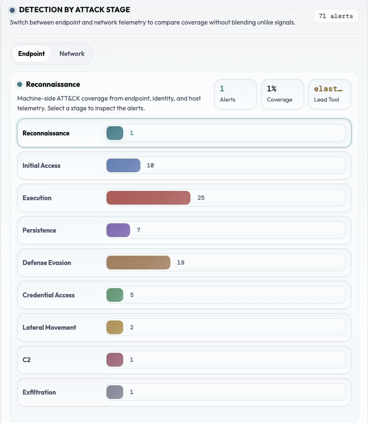
This component went through three distinct iterations. Each one solved the cognitive load problem introduced by the previous design, and the progression illustrates the core discipline of the entire project: reducing the number of cognitive operations required to answer a single question.
Version 1: Nine separate bars. Each MITRE stage got its own horizontal bar proportional to its alert count. To understand the distribution of detection activity across the kill chain, the analyst had to visually compare nine separate bar heights: sequential scanning with working memory overhead. You had to construct the picture yourself. The distribution was data, not information.
Version 2: Single stacked bar. All nine stages collapsed into one proportional bar. Distribution was now visible as a shape: you could see at a glance that Execution consumed 40% of alert share while Reconnaissance was nearly absent. That is a four-second perception from something that took four minutes with nine bars. But tool attribution disappeared. You could see the distribution but not which tools were driving it. One question answered, a different question created.
Version 3 (current): Single bar + per-tool drill-down. The bar answers "where is activity concentrated?" The click answers "which tools are responsible?" Two distinct questions, two distinct UI layers. The staggered bar-width animation on entry serves attention guidance: the widest bars animate most visibly, drawing the eye to the most active MITRE stages before the analyst reads a single label. This is animation in service of information hierarchy, not in service of delight.
Fleet Sensor Grid: Pre-Attentive Coverage Gaps
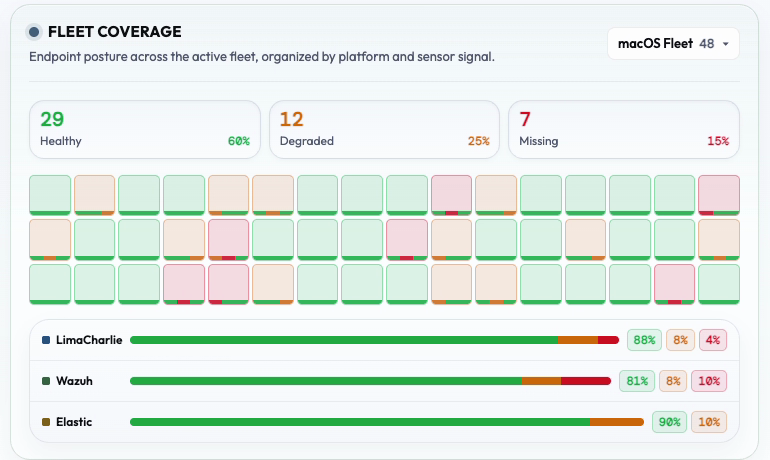
Intune, LimaCharlie, and Wazuh each maintain their own device tables. Across those three consoles, you cannot see in one place which devices are covered by all three sensors, which have gaps, and which are entirely unmonitored. That gap is not a data problem: it is a layout problem. The Fleet Sensor Grid solves it by making coverage status a visual pattern rather than a query result.
The pixel-grid heatmap puts one square per device, colored by worst-case sensor status across all three tools. At 16 columns, you see 48+ devices simultaneously without scrolling. Each square has a 3-segment bottom strip showing the individual status of Intune, LimaCharlie, and Wazuh independently. The worst-case color is the dominant fill so problems demand attention without hover: the most important signal is the one that doesn't require an interaction to see.
A table with 48 rows and 3 sensor columns requires sequential scanning. The heatmap is pre-attentive: spatial patterns are processed before conscious attention is directed. You can perceive "there's a cluster of yellow in the bottom-right" without reading anything. That cluster tells you there's a zone of the fleet with sensor gaps. You can then hover to find out which devices and which sensors before opening a single tool console.
The fleet tab switcher (All / macOS / Windows / Linux) exists because coverage gaps are often platform-specific. A macOS fleet may have 95% LimaCharlie coverage because agent deployment is straightforward via MDM profile. A Linux fleet may have gaps because agent deployment requires manual scripting. Platform-aware filtering surfaces these patterns without requiring cross-referencing between separate tool dashboards.
Correlation Chains: Multi-Tool Signals as First-Class Entities
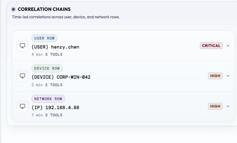
Multi-tool correlation is the hardest problem in security operations. Individual tools don't know about each other. The analyst's mental model has to hold signals from Wazuh, Elastic, LimaCharlie, and Entra simultaneously to recognize a kill chain in progress, and that mental model resets every shift, every context switch, every tab close.
Pre-correlated chains are surfaced as first-class entities on the Overview, not as individual alerts the analyst must connect. Each chain shows the entity at the center (user, device, or IP), the time window the chain spans, the tools whose signals contributed, and the severity of the combined cross-tool signal. This is the signal the analyst would eventually construct manually. BlendScope surfaces it before they have to ask.
The entity-type color coding (blue for user identity, green for device, violet for IP) is a consistent visual language carried across every surface in BlendScope. An analyst who sees a blue chip on the Overview knows immediately that the pivot point is a user identity before reading the label. This reduces the parsing overhead on every chain, every time. Visual grammar only pays dividends when it is applied consistently: inconsistent color semantics require re-reading, which defeats the purpose.
The event cards inside each expanded chain show the temporal sequence across tools: what Wazuh saw first, what LimaCharlie picked up next, what Entra confirmed. This cross-tool narrative is something no individual SIEM can produce because each tool only knows its own event stream. Surfacing it on the Overview turns the command center into something that actually reasons about the environment, not just displays it.
The Calm Before Critical Design Language
Every visual decision on the Overview is downstream of one principle: the default state should feel calm. Signals of urgency should interrupt the calm, not compete with ambient noise that was already there. This principle sounds simple and is genuinely difficult to execute, because it requires resisting almost every conventional SIEM design instinct.
The warm cream/linen background and warm stone borders create a visual environment that reads as neutral and settled. This is a deliberate contrast with dark-mode, high-saturation palettes common in security tools. Those palettes communicate urgency as their default state: everything looks like something is happening all the time. The consequence is that actual urgency signals get absorbed into ambient visual noise, and analysts habituate to the "everything looks critical" baseline. When everything is urgent, nothing is.
On BlendScope's Overview, the warm neutral background means a red element is genuinely salient. When the health badge flips from a green "Posture: Nominal" pill to a red "29 critical alerts active" pill, the contrast is real and immediate, nothing else in the interface is competing for that register of urgency. The signal interrupts rather than adds to noise.
Pulse dots on healthy tools breathe slowly: they are live indicators that operate at a frequency that reads as "heartbeat" rather than "alarm." An offline tool's dot does not pulse. The absence of pulse is itself a signal: silence stands out on a surface where everything else is quietly alive. No section on the page resets or reflows on its own. The only things updating in real time are the clock, the agent sparklines, and the Telemetry River, chosen deliberately because none of them force the analyst to re-read a section they had already scanned.
Implementation Notes
No component performs a periodic full re-render or content swap. The clock, agent sparklines, and Telemetry River are the only elements on a timer, and each updates through a targeted attribute or transform change rather than a re-render of surrounding markup, so nothing shifts layout or forces a re-scan of static content nearby.
Why We Removed Recharts: Design Control Over Convenience
The decision to replace all Recharts visualizations with custom SVG was deliberate, not tactical. It followed directly from the calm-first design principle: library charts carry embedded design assumptions baked in by their maintainers for general-purpose use, not for a calm-first security interface.
In a system where color carries semantic weight (red means critical, amber means warning, green means healthy, blue means user identity), a general-purpose charting library's own color defaults introduce noise that undermines that semantic layer. Enforcing our palette consistently through a library built around its own defaults meant constantly fighting its assumptions rather than working with them, so we removed the friction instead of managing around it indefinitely.
Animation is the same story. Library chart animations are tuned for "wow, data loaded" reveal effects: they draw attention to themselves the moment they appear. On a dashboard that updates every second or so, a chart that re-animates its bars on every refresh becomes an attention tax that compounds across an entire shift. Custom rendering let updates stay quiet: a small, targeted change on screen, invisible to the analyst unless the value shifts meaningfully.
The Agent Baseline Monitor's sparkline needed three tightly synchronized layers, the live line, the ghost baseline, and the deviation fill, plus careful handling for when an agent's feed drops out entirely. No charting library ships that specific combination as a built-in option. Building it on top of one would have meant overriding the library's own rendering internals to get there, and at that point we would have been working against the tool rather than with it. Doing it ourselves also kept the result genuinely simple: a small, purpose-built piece of code that does exactly what it says, rather than a thin wrapper straining against a much larger library it was never quite meant to be.
Implementation Notes
Recharts applies its own color palette by default and requires overriding nearly every themeable element to fully suppress it; the override surface isn't built for that level of control, so in practice every chart update carried some risk of a library default color leaking through.
The AgentBaselineMonitor sparkline needs three synchronized SVG path layers: the live line, the ghost baseline, and the deviation fill polygon, with null-gap handling that splits the live line at drop-out points. No charting library ships this combination as a primitive. The custom buildPath function that generates all three paths is about 40 lines of code. A rough Recharts equivalent would be closer to 8 lines but couldn't reproduce the same visual behavior, and forcing it to would mean overriding the library's internal path generation, at which point the visual contract is defined by the library rather than the design system.
Design Philosophy
UX Principles Applied
The Overview does not show every available metric. A dedicated tool-health panel and a detection funnel view both exist and are ready to use, but neither is included by default. The current layout communicates what it needs to without them. Adding more panels would not improve ambient awareness; it would dilute it.
The sparklines and Telemetry River particles are designed to be visible in peripheral vision. You do not need to read them: you need to notice when they look different. That is a meaningfully different cognitive mode than the one triggered by a blinking alert badge.
Kill Chain shows the distribution bar by default. Device Risk shows 8 devices. Correlation Chains show collapsed headers. Every component surfaces the one-second read first and puts depth behind an explicit click, never the reverse.
Every component on this page has a clear path to a deeper investigation surface. Correlation Chains lead to Timeline or Gravity Well. Kill Chain alert cards lead to the relevant tool page. The command center is where investigations begin, not where they end.
The Kill Chain bar fill is lighter toward the right edge, creating a directional sense of "moving forward" along the attack chain axis. The deviation fill uses 7% opacity to be present but not dominant. Every gradient in this system encodes something. None are decorative.
Kill Chain bar entry is delayed 260ms with spring ease-out. Device Risk pills stagger at 30ms per row. Counters ease in with a curve that spends most of their duration near the final value rather than ticking evenly. Every timing decision is purposeful: the animation tells the analyst where to look, then gets out of the way.